The Challenge
One of our clients, a major American insurance company, asked us to design an educational portal for their customers in order to explain and advise on all the options of insurance. The way people shop for insurance has changed dramatically, and our client needed a site that would inform consumers about the variety of insurance plans offered in order to help understand what would best suit them and why.

Our Solution
We created a user-centered, CMS driven site to guide consumers in learning about insurance topics that are directly connected to their needs. The portal included and connected to a large article database that was intelligently structured in order to create meaningful contexts of unbiased information that would make finding and digging deeper into topics of interest effortless. In addition to the several different intuitive methods of navigation, the portal was uniquely designed to be visually appealing and included various tools to make it more fun, easy and personalized for the audience to be able to consume otherwise difficult subject matters.
- Talk to not at people
- Create a personal experience for the consumer
- Offer unbiased information
- Maintain a level of neutrality
Modular Information Architecture
In order to support the significant amount of content involved in this project, our skilled development team built the website from the ground up using TYPO3. This allows the site to be completely customizable to the needs of the client as well as scalable to accommodate future growth. We created an industry article database with filtering functionality, and tagged each piece with metadata so they could be easily found.
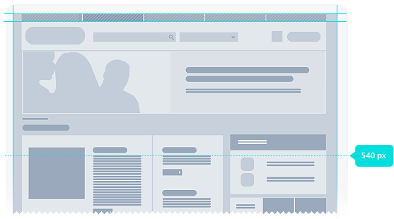
Multiple Methods of Navigation
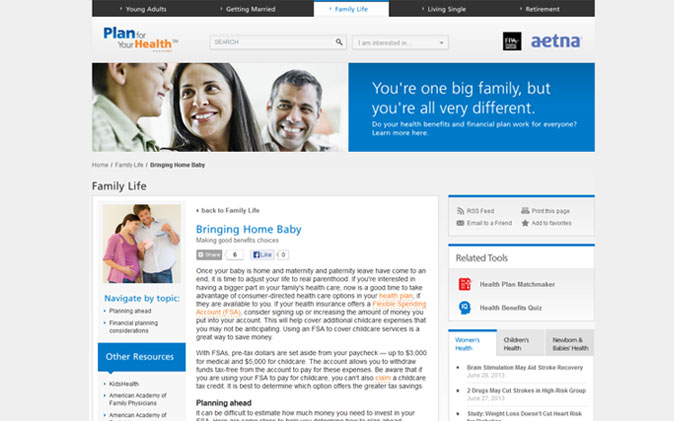
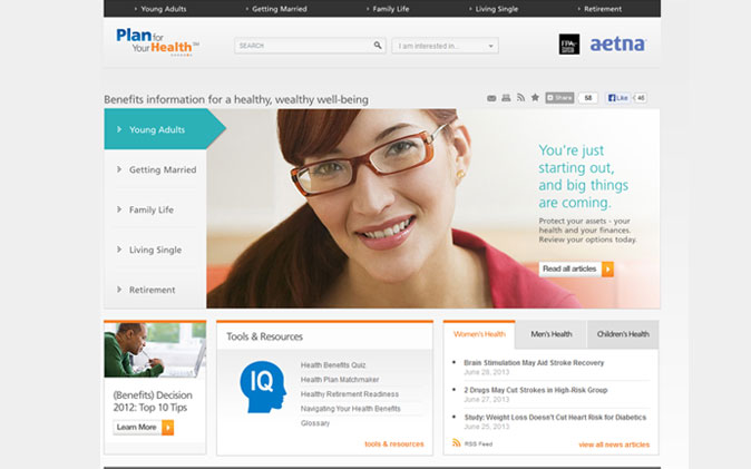
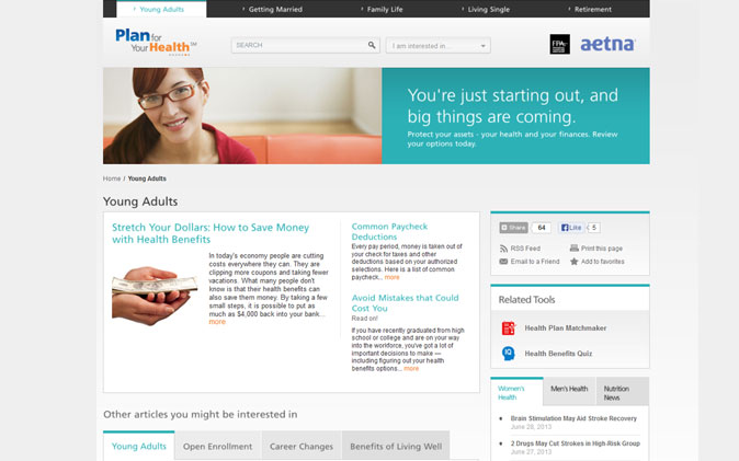
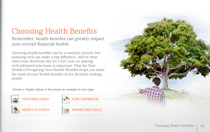
We architected an intelligent navigation system to cater to the unique needs of each user, whether they were planning for a major life event or were just interested in learning more about healthcare options. This resulted in a more personalized and convenient experience for the user. In addition, we created navigation options within each article which gave the user easy access to the glossary and related articles, in order to provide them with the most informative experience possible.
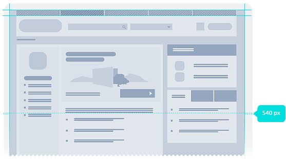
Multiple Methods of Navigation
We architected an intelligent navigation system to cater to the unique needs of each user, whether they were planning for a major life event or were just interested in learning more about healthcare options. This resulted in a more personalized and convenient experience for the user. In addition, we created navigation options within each article which gave the user easy access to the glossary and related articles, in order to provide them with the most informative experience possible.
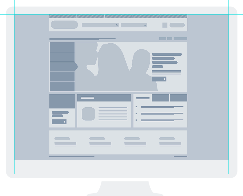
Brand Consistent Interface
To ensure that the site remained true to Aetna’s brand, we utilized their new corporate color palette in our design. This palette featured varying colors based on their five key audience categories and were applied throughout each section's architecture for a unique and consistent look and feel. Real life images served to visually and emotionally connect with our client's diverse audience, while white backgrounds were used to draw the eye to interactive areas and increase readability.
Making
Learning Fun
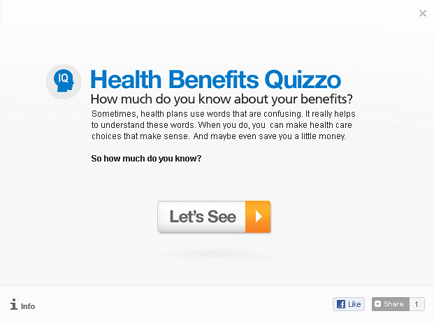
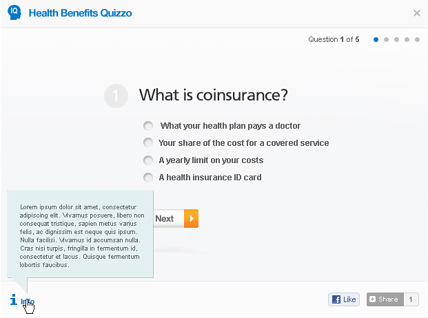
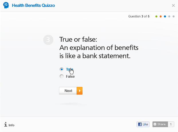
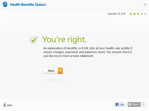
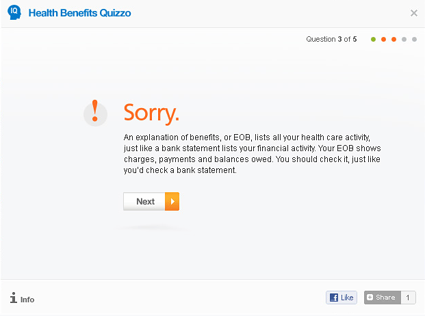
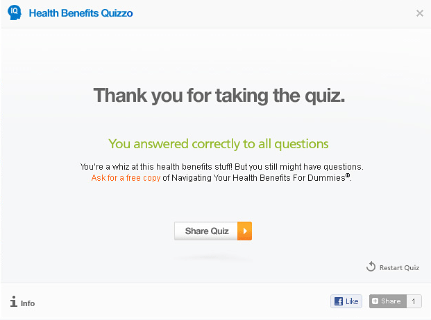
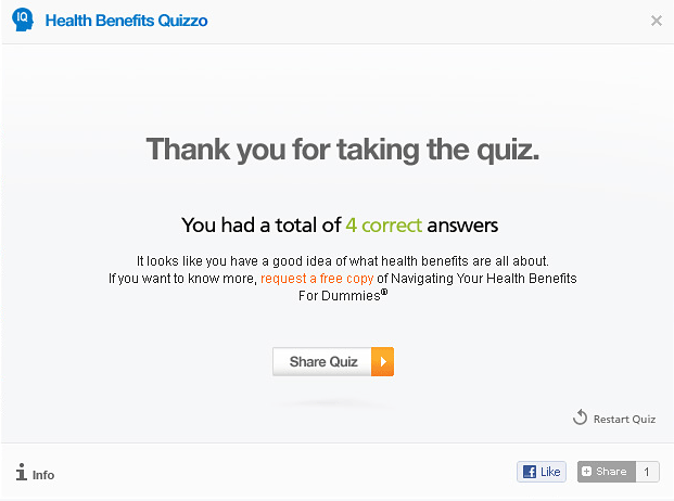
From the extensive user research we conducted, it was clear that the average user is often unfamiliar with terms commonly used in the insurance industry. To alleviate this issue we created quick roll-over definitions within each article as well as a glossary where each term is explained in depth. Short quizzes allowed the users to test themselves on their knowledge of commonly used terms. This gave personalized feedback that increased the impact of the information.
Social media functionality was integrated into the design to allow for effortless sharing of information with family and friends. An extensive RSS system was also embedded to allow users to subscribe for updates on specific topics of interest.
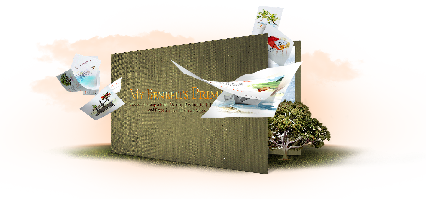
A Virtual Book
Looking for a more enjoyable and easy way for the user to experience articles, we transformed the client's main article into a virtual book. This book showcased the content in a user-friendly manner and offered the user a more interactive experience.
Branded Icons
In our design for the website we perfected even the smallest details, including the icons, color palette and the images, in order to set a specific tone for the overall experience. The colors are clean and delineate each category making it easy for a user to navigate through the site.
Technology Solution
The entire project required a high level of support which was provided through various technologies. These included the TYPO3 CMS for the back end as well as HTML, CSS3, Javascript and jQuery for the front end. All the above contributed to the connections we formed with other content sources such as Harvard Medical School. Our years of experience in creating high volume information portals ensure that these are tested on and compatible with all browsers.