
Here at customedialabs, we know good UX design! Of course, that also means we know bad UX design when we see it. Sometimes, it is a little mistake that catches our eye. Other times, we run across an entire website that could make a user bounce faster than a bad check on a trampoline. So how can you create a website effective at capturing the audience’s attention while maintaining its usability?
While there are an enormous number of ways you can do this, there are an equal number of things to avoid.
Here is our list of some of the most common User Experience mistakes we come across. Fortunately, most are also very easy to fix. Often, the solution is as easy as, “Just don’t do it!”
 Unique Icons
While unique features can give a website an edge, they can also be its downfall. Universal icons are universal for a reason: everyone understands them! Unique icons can cause confusion when it isn’t instantly obvious what they represent. Nobody likes spending the time trying to figure out which icon will get them to their endpoint . . . or worse, clicking on the wrong icon and doing something you didn’t intend! Our advice? Keep it simple. Stay close to established patterns and conventions. Straying too far from the familiar can
cause confusion.
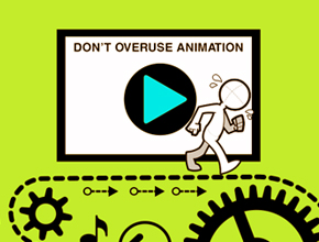 Too Animated
We all appreciate the way animation can draw the eye or create an interactive experience, but too much of a good thing can be . . . well, just too much. Animation overkill can backfire since it will distract users from the actual purpose of the website. Just because it can move, doesn’t mean it should. So if you have to count the number of flashing, twirling, scrolling, and dancing images on your site, you probably need to curtail the chaos.
 Flags Representing Languages
A flag icon can represent a number of things: a nationality, a location, a currency, a time zone, a date format, and often a language. Therefore, a flag icon on a multilingual website can often be a little ambiguous. When creating a language menu, the easiest solution is to use the flag as well as writing the name of the corresponding language in its own alphabet.
 Hide and Seek
The internet has put an unfathomable amount of information at our fingertips. We’ve come to expect to access the information we need quickly and easily. So, one User Experience mistake we avoid is burying information deep within a website. Nobody enjoys searching through link after link to find a bit of information, like a map or a phone number.
The first step to avoid this issue is to design clear information architecture. This includes creating a straightforward sitemap and developing clear information paths throughout the website.
Another helpful function to install is a search component for the user. A functional search bar will increase the “findability” of content on your website, contributing to a more convenient user experience. By making things easy to find in just a few clicks you spare users from having to “treasure hunt” on your site.
 Tiny Issues
Do you ever find yourself leaning closer and closer to your computer screen, or holding your phone so close it almost touches your nose? Tiny text is frustrating for some and downright impossible for others. If it is worth putting on a website, it must be worth reading, so let us read it!
And what about that tiny ‘x’ needed to close an ad or banner? A few of us at customedialabs suffer from the “fat finger” effect and often, on a mobile device, end up clicking on the ad itself. Small interaction areas, in general, can be very frustrating to the user. The solution? Make it bigger!
There are general guidelines for designing on each type of platform interface, including the minimum sizes for such things as interaction areas. The best way to avoid such mistakes is to follow the guidelines for the platform for which you are designing.
While User Experience is a huge field, if you always keep the needs of the user as the highest priority, you will be headed in the right direction.
COMMENTS