
When shopping for a new car, you test-drive it down busy city streets and high-speed freeways. Home buyers often tour the home on a sunny day, then stop by during a rainstorm to see how the yard responds. We know that things change, and when investing in something, we want to ensure we are getting what we want in every potential situation. So why are so many businesses reviewing their new company website – the virtual calling card of their brand – on their office computer, and only there?
There is a crucial step being missed here – the review of the site in every potential situation. How will it look on a smartphone? A tablet? In a digital society where about 60 percent of web traffic comes from mobile devices, the way a website shifts and displays to accommodate these users is paramount.
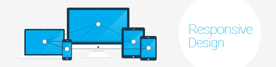
Responsive website design as a concept
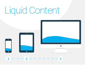
Like nearly everything related to the online space, responsive website design is a newer and continually evolving concept. It was born in 2004 as smartphones officially dominated the mobile market. Referred to by numerous terms – such as “flexible”, “liquid”, and “fluid” – it basically refers to the ability of a web page design to shift and display differently using CSS3 media queries depending on screen and viewport size. Responsive design treats the page’s content like water, pouring it into whatever vessel is needed and transforming the individual pieces into the most appropriate layout.
 Major components of responsive website design include:
- Fluid grid concept for page element sizing to be in relative units, like percentages
- Flexible images and videos which adapt on different screen or viewport sizes
- Flexible typography which adapts on different screen or view port sizes
Responsive design is supported by all modern web browsers, including Mozilla Firefox, Google Chrome, IE10+, Opera, and Safari, as well as all mobile browsers.
Why responsive design is a must
With the continued development of smartphones and tablets, and the inevitable rise of other devices like smart watches, smart TVs, and car screens, responsive websites are a must have for all companies. The Internet is now almost exclusively utilized on the go, making it essential for companies to offer excellent user experience for their website or lose viewers to a competitor that has one.
A responsive website is mobile-friendly, too; customers owning a responsive website will be ranked higher by Google’s search engine.
Responsive website design best practices to consider
Developers and designers must take into consideration the architecture and specifications of each device and how users use it. For example, smartphones don’t have much CPU power and users often access websites using mobile services (3G, 4G) and Wi-Fi. Tablets and small laptops are more powerful than smartphones.
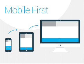 • Mobile first
Developers should consider the browsing experience of the low-tech mobile phone first and work their way up. The foundation of the website should be simple, and users should be able to browse through the site and navigate the areas of interest easily.
Most designers work the opposite way, creating an advanced website and thinking about how it will look on low technologically advanced phone as an afterthought.
• Responsive typography and breakpoints
Breakpoints enhance each user’s experience, and developers and designers must design and test these natural rest areas on every device in order to give the user the right experience.
Fonts must also be responsive in order to allow the best viewing experience. Select a font that works well when zooming in or out depending on the screen from which it is being viewed. It must be easy to read, clean with no overlapping. Choose a font that will not vary from one device to another, and browsers too. Lastly, but most importantly, the width of the viewing screen must be taken into consideration. A desktop computer’s best viewing experience will be 50-75 characters per line, but on mobile devices it’s only 35-50 characters.
“Exiting Photoshop and entering the browser to test your mockups will help to improve both designs and user experience.”
 • Responsive images and videos
Images can be the bane of a developer’s design. Due to varying dimensions of devices on the market, the image must be able to be viewed in different dimensions. Performance issues are often caused by the huge load times of images, so they should be used sparingly and for the most impact. Some well-known practices for better performance are vector graphics, which are scalable, maintain their quality, and can adapt to fit the screen size of every device. Moreover, icon fonts (FontAwesome, Fontello, Zurb Foundation iconfont, etc.) can replace simple image graphics (arrows, sorting icons, stars etc.). Last but not least, CSS3 gradients for backgrounds are scalable across different layouts without demanding additional HTTP requests.
• Responsive navigation
Navigating inside the website with ease is vital. The user must always be able to know his or her location on the website and be able to navigate elsewhere. A website’s capabilities must be ideal across all devices.
• Using a CSS framework to do the job
A CSS framework (Zurb Foundation, Bootstrap, Skeleton) can save time in terms of developing the website and eliminate some problems before they occur. Less debugging is needed since the framework offers a well-tested developing environment to use. Ensure your designers understand how the system works prior to their first mock-ups to save time and avoid layout conflicts.
In the end, responsive design is essential to the success of your online presence, and will only become more of an urgent need as technology continues to progress. Contact us about how we can bring your website to the next level and ensure the continually growing population of mobile viewers is seeing your site, in all its fluid, beautiful glory.
COMMENTS